A fresh coat of exterior paint instantly boosts your home’s curb appeal while protecting the structure from severe weather damage. If you want a cleaner, calmer, and easier-to-manage exterior, stepping away from outdated colors makes a massive difference. The latest exterior paint trends embrace warm neutrals, nature-inspired greens, and bold charcoal accents that completely simplify your home’s aesthetic. Choosing the right modern color palette highlights architectural details without requiring constant upkeep or weekly washing. Whether you are updating a classic colonial or refreshing a mid-century ranch, these nine exterior paint trends offer highly practical ways to elevate your property. You can achieve a crisp, sophisticated finish that lasts for years just by selecting the right high-quality, durable paint formulas. Let’s explore the top choices.
Warm White for a Crisp Foundation
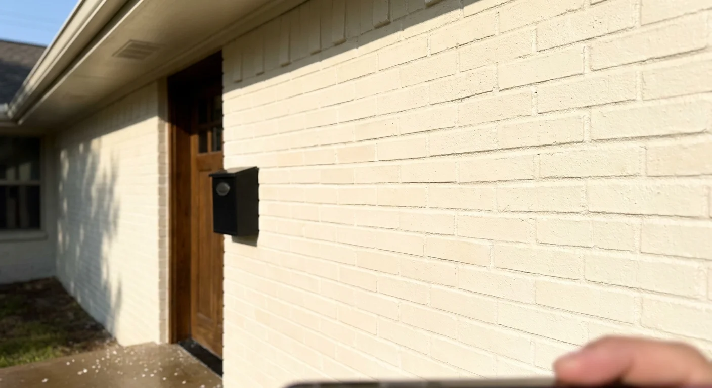
Stark, blinding whites often look sterile and show every speck of dust, but warm whites deliver a remarkably clean and inviting exterior. Warm white formulas contain subtle undertones of yellow or beige, which help the paint hide minor dirt and environmental grime much better than pure titanium white. This trend dominates modern farmhouses, updated colonials, and traditional brick homes because it provides a fresh slate that pairs perfectly with any trim color.
Beyond aesthetics, warm white serves a highly practical purpose related to energy efficiency and durability. Paint colors receive a Light Reflectance Value (LRV) rating on a scale from 0 to 100. Colors with a high LRV reflect a significant amount of visible light and heat. By painting your home a high-LRV warm white, you bounce ultraviolet rays away from your siding; this reduces thermal expansion and contraction, which ultimately prevents premature peeling and cracking. You can learn more about how Light Reflectance Value impacts design and durability to make an informed decision for heavily sunlit exteriors.

Earthy Sage Green for Natural Harmony
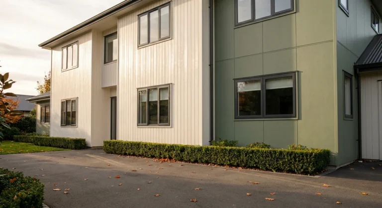
Homeowners increasingly want their properties to blend organically with the surrounding landscape. Earthy sage green achieves this beautifully. Unlike dark forest greens that fade aggressively in direct sunlight, mid-tone sage green holds its color integrity for years. This muted shade creates a calming, natural harmony that looks spectacular on Craftsman bungalows, board-and-batten siding, and heavily wooded lots.
From a maintenance perspective, sage green acts as a master of camouflage. Spring pollen, airborne dust, and minor algae growth easily disrupt the appearance of light gray or white houses. Because sage green shares similar organic tones with these environmental elements, your house continues looking clean even when it is slightly dirty. Pair sage green siding with natural cedar columns or copper light fixtures to enhance the biophilic design and boost your home’s earthy appeal.
Charcoal Grey for Bold Contrast
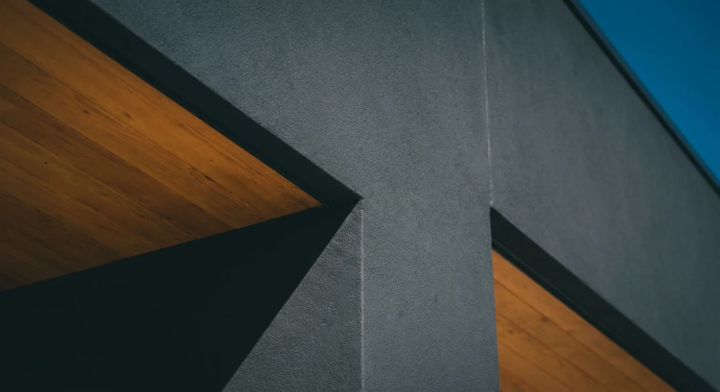
If you want a modern, striking exterior, charcoal grey delivers dramatic definition. This deeply saturated color transforms dated brick and worn stucco into sleek, contemporary facades. Charcoal grey works exceptionally well when you need to modernize a property quickly, as the dark tone masks architectural imperfections, uneven siding, and previous patching jobs.
You must approach dark exterior colors with a bit of scientific caution. Dark paints absorb immense amounts of heat. If you apply a standard charcoal paint over vinyl siding, the absorbed heat can actually melt or warp the plastic panels during peak summer months. To prevent this, always purchase “vinyl-safe” paint formulas. These specialized acrylic latex paints utilize heat-reflective pigments to maintain the bold charcoal aesthetic without compromising your siding’s structural integrity. Apply this color primarily on fiber cement, wood, or brick surfaces where thermal warping poses less of a threat.
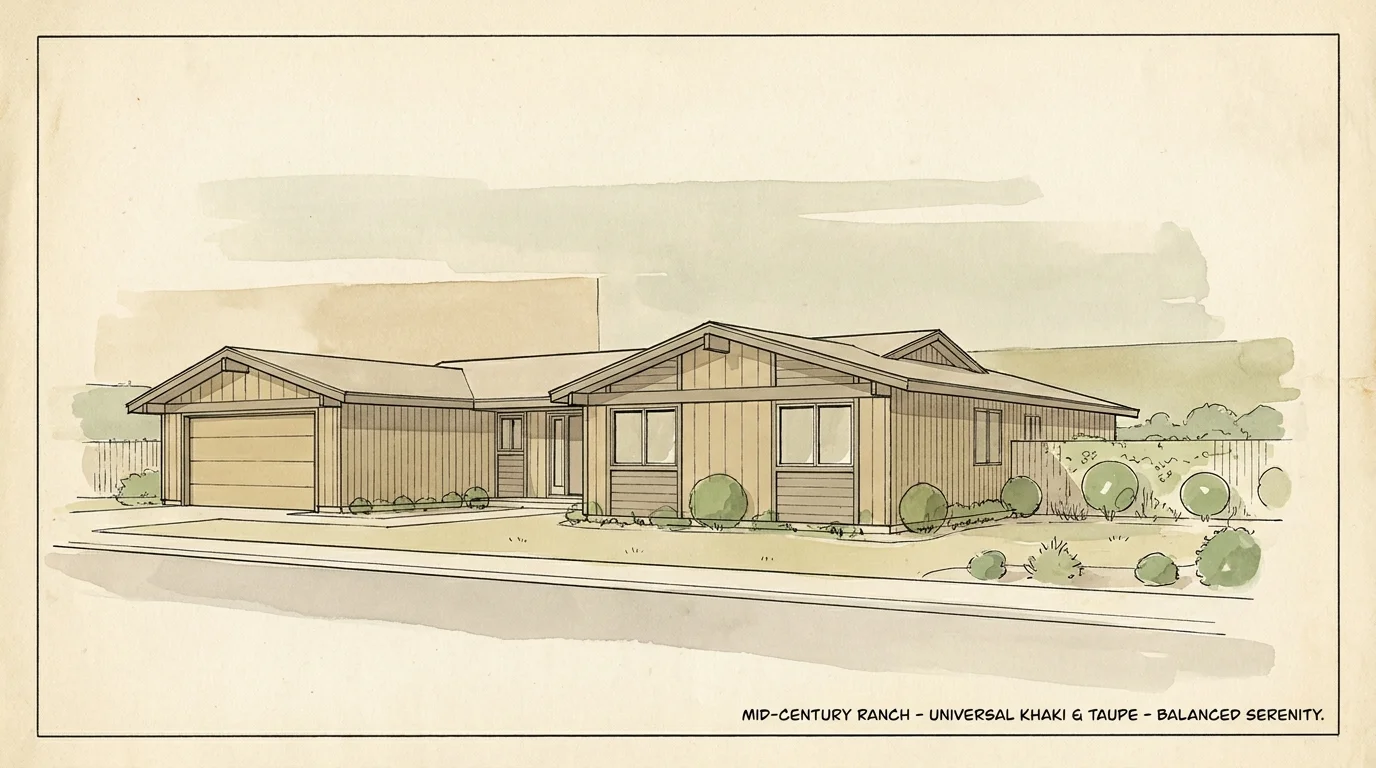
Universal Khaki and Grounded Beiges
The era of cool, icy grays has ended. Universal khaki and warm, grounded beiges have completely taken over modern exterior palettes. These earthy neutrals offer a grounded, stable appearance that immediately makes a house feel like a home. Khaki bridges the gap between classic traditionalism and modern warmth, offering a sophisticated background that allows your landscaping and hardscaping to stand out.
Khaki is arguably the most practical color you can choose for a low-maintenance exterior. Rain frequently splashes mud and dirt onto the lower two feet of your home’s foundation. While this splashback creates distinct, ugly lines on white or light gray houses, khaki absorbs the soil tones seamlessly. You will find yourself pulling out the pressure washer far less often when you embrace these grounded beige tones. Pair universal khaki with crisp white trim to keep the overall look sharp rather than muddy.
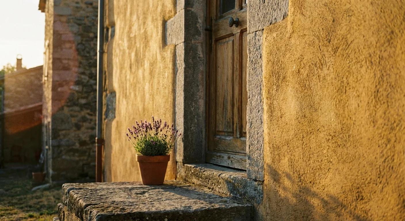
Soft Ochre for European Elegance
Sometimes called Epernay, soft ochre introduces the warmth of sunlit stone to your exterior. This muted, sophisticated yellow-brown mimics the historic plaster and stone facades found throughout European countryside estates. Soft ochre avoids the blinding, overly cheerful intensity of bright yellow, offering instead a serene, historic elegance that elevates standard suburban architecture.
Soft ochre performs exceptionally well in climates with long, gray winters. The warm pigment creates a welcoming glow even on overcast days. Furthermore, yellow-based pigments historically resist fading better than red or blue pigments. When soft ochre eventually does weather, it simply looks like naturally aged stone rather than degraded paint. Use this shade on stucco homes, Mediterranean-style builds, or properties featuring heavy natural stone accents.
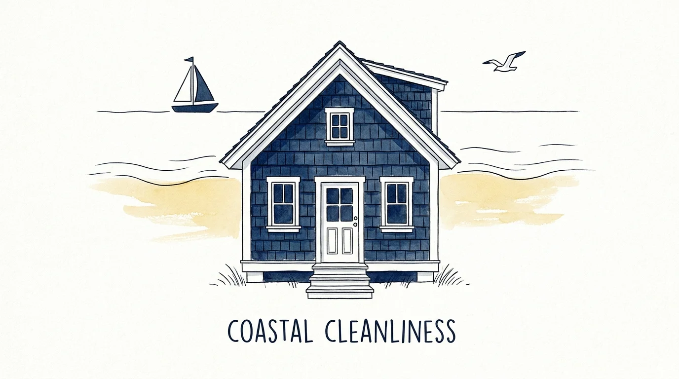
Deep Naval Blues for Coastal Cleanliness
Deep naval blue offers a tailored, nautical crispness that never truly goes out of style, but it is seeing a massive resurgence in modern neighborhoods. This rich shade provides the same visual weight and high contrast as charcoal or black, but it injects a subtle touch of color that feels more approachable. Naval blue looks spectacular on Cape Cods, coastal properties, and traditional two-story homes.
To keep deep blue looking clean, you must invest in premium 100% acrylic paint. Lower-quality blue paints tend to “chalk” as they break down under UV exposure, leaving a powdery white residue on the surface that ruins the crisp aesthetic. Premium acrylics form a flexible, durable bond that locks in the deep blue pigment. Always use a satin finish for dark blues; the slight sheen helps reflect sunlight and makes it much easier to rinse away spider webs and dust with a garden hose.
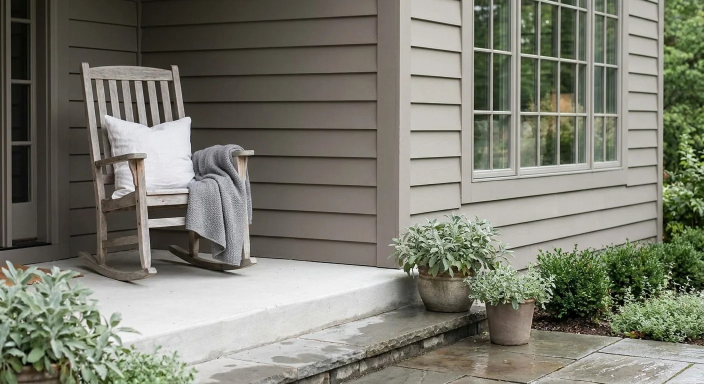
Muted Taupe for Balanced Serenity
Taupe acts as the ultimate exterior chameleon. Sitting perfectly between gray and brown, muted taupe shifts its appearance based on the time of day and the angle of the sun. In the morning light, it may lean toward a crisp, warm gray, while the evening sunset brings out rich, earthy brown undertones. This versatility makes taupe a foolproof choice if you struggle to commit to a specific color family.
Taupe flatters nearly every architectural style and neighborhood setting. It works exceptionally well if you have a brick or stone facade that you do not plan to paint. Instead of fighting with the existing masonry, taupe pulls from the natural mortar lines and stone variations to create a cohesive, deliberate design. Like khaki, taupe expertly hides road grime and airborne exhaust, making it an ideal choice for homes located on busy streets or near highways.
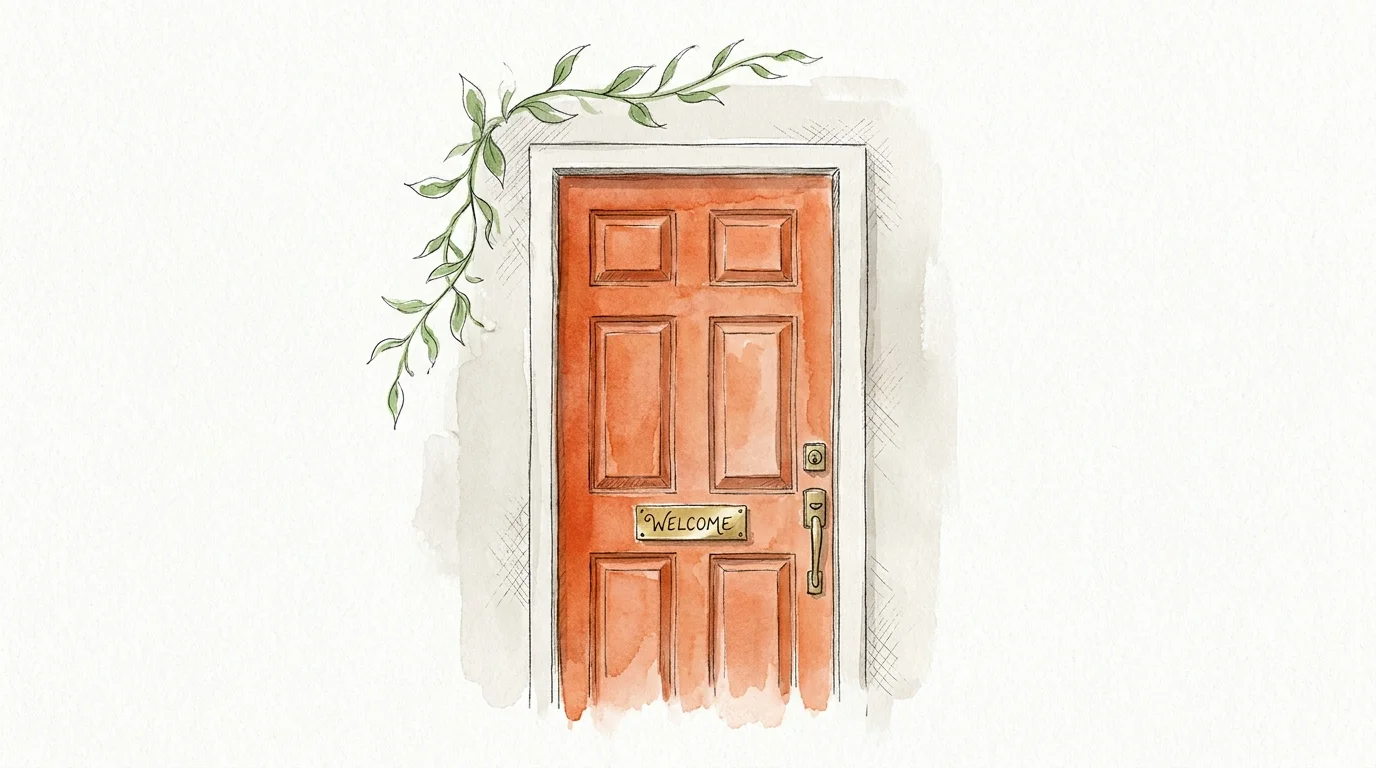
Terracotta Accents for Warm Vibrancy
You do not need to paint your entire house to embrace the latest exterior trends. Terracotta is emerging as a dominant accent color, replacing standard red or black doors. This baked-earth tone brings instant warmth, vibrancy, and personality to a home’s exterior without overwhelming the senses. Terracotta feels organic, welcoming, and distinctly modern.
Apply terracotta paint to your front door, window shutters, or porch ceiling. By isolating this vibrant color to high-impact architectural elements, you draw the eye exactly where you want it—usually toward the main entryway. Accent painting requires significantly less time, money, and commitment than a full exterior job. If the terracotta trend fades over the next decade, you can easily repaint a door in a single afternoon, keeping your home’s overall aesthetic fresh and up to date.
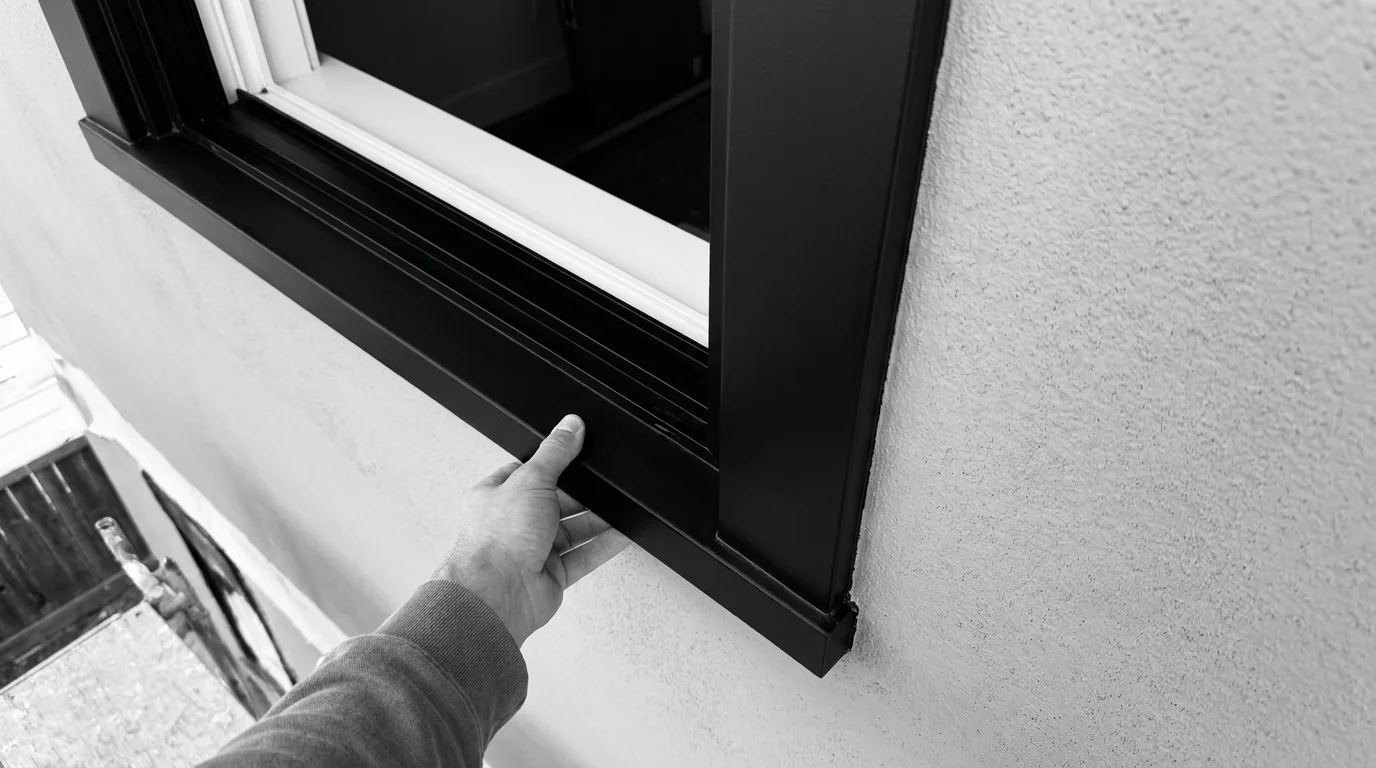
Matte Black Trims for Modern Definition
For decades, standard white trim served as the default choice for framing windows, doors, and rooflines. Today, matte black trim is revolutionizing exterior design by providing a sharp, graphic outline that makes your primary siding color pop. Black trim acts like a picture frame, defining the edges of your home and drawing attention to interesting architectural geometries.
Matte black trim offers a distinct cleaning advantage. White trim around windows acts as a magnet for visible dirt, bug speckles, and mildew. Black trim hides all of these common exterior nuisances, keeping your window frames looking sharp between seasonal cleanings. However, you must choose a matte or satin finish; high-gloss black trim highlights every single dent, brush stroke, and imperfection in the wood. A matte finish absorbs the light, creating a smooth, velvety border that looks incredibly sophisticated.
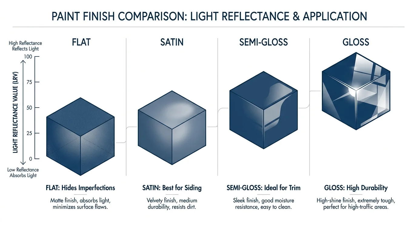
Smart Finish Selection Guide
Choosing the right trend color only solves half the puzzle; selecting the correct paint sheen determines how easy your home will be to clean and maintain. Use this table to match your exterior surfaces with the optimal paint finish.
| Finish Type | Best Used For | Practical Benefits | Maintenance Level |
|---|---|---|---|
| Flat / Matte | Older wood siding, stucco, brick, masonry | Hides surface imperfections, dents, and rough textures beautifully by absorbing light. | Harder to wash. Holds onto dirt and requires gentle pressure washing. |
| Satin / Eggshell | Fiber cement, new wood siding, vinyl | Offers a slight sheen that resists mildew and allows rain to wash away surface dust. | Easy to maintain. The best all-around choice for primary exterior walls. |
| Semi-Gloss | Trim, window frames, doors, gutters | Highly durable, resists moisture penetration, and stands up to frequent touching. | Very easy to wipe clean with a rag and mild detergent. |
| High-Gloss | Front doors, specific architectural accents | Creates a brilliant, glass-like finish that makes colors appear incredibly rich and deep. | Shows every underlying dent or scratch. Requires meticulous surface preparation. |
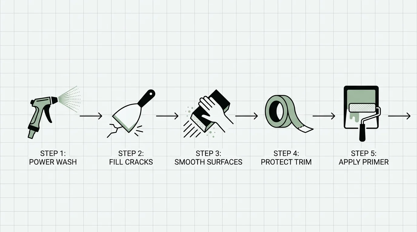
Step-By-Step Exterior Painting Preparation
A flawless, clean-looking exterior paint job relies entirely on your preparation. Skipping steps guarantees peeling paint and wasted money within a year. Follow this practical checklist to prepare your home’s exterior safely and effectively.
- Check for Lead Paint Hazards: If your home was built before 1978, it likely contains lead-based paint. Scraping or sanding this paint releases highly toxic dust into your yard and lungs. Before doing any prep work, test your siding. If lead is present, you must follow the EPA’s lead-safe work practices for DIYers, which include using heavy plastic sheeting, misting surfaces with water before scraping, and utilizing a HEPA vacuum.
- Protect the Surrounding Environment: Lay canvas drop cloths over your garden beds, bushes, and hardscaping. Tape thick plastic sheeting over your windows, doors, and exterior light fixtures to protect them from accidental drips and overspray.
- Clean the Surface Thoroughly: Paint cannot bond to dirt, chalking, or algae. Wash your house using a pump sprayer filled with a TSP (trisodium phosphate) substitute and water. Use a soft-bristle brush to scrub stubborn areas, then rinse the siding from the top down with a garden hose. Avoid aggressive pressure washing, which can force water behind your siding and cause hidden mold growth.
- Scrape and Sand Flaking Areas: Once the siding is completely dry, use a carbide paint scraper to remove any loose, bubbling, or peeling paint. Sand the edges of the scraped areas smooth so they blend seamlessly with the bare wood. Remember to review the EPA guidelines on sources of lead exposure to ensure your soil remains safe during this scraping process.
- Apply a High-Quality Bonding Primer: Bare wood, exposed masonry, and heavily repaired areas require primer. Primer seals porous surfaces and creates a tacky layer that your topcoat grips tightly. Tint your primer toward your final paint color if you are applying a dark trend color like charcoal or naval blue.
- Select Low-VOC Paint Formulas: Volatile Organic Compounds (VOCs) release harsh chemical fumes into the air as paint dries. Protect your local air quality and your own respiratory health by choosing exterior paints that comply with strict emission standards. You can read more about how to manage these chemicals through the EPA’s resources on Volatile Organic Compounds.
Take a walk around your property this weekend and inspect the condition of your exterior trim and siding; identify the areas where the current paint is chalking or peeling so you know exactly how much prep work your new color transformation will require.