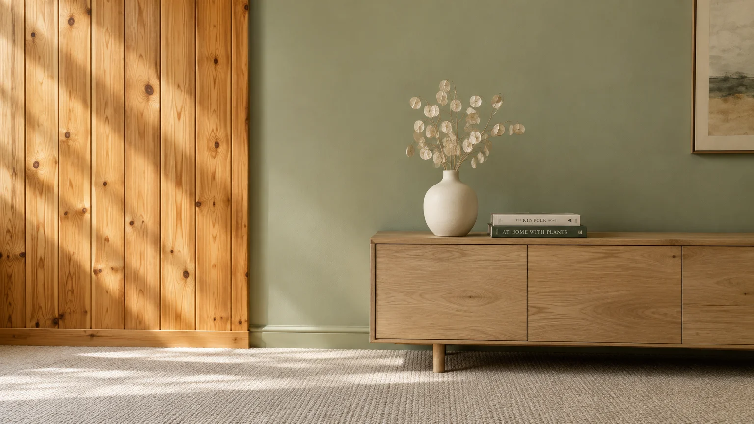
You can transform a dated, dark wood-paneled room into a bright, welcoming sanctuary with the right paint palette. Whether you plan to paint over the boards or highlight their natural grain, color choices make all the difference.
Warm wood surfaces carry heavy undertones of orange, red, or yellow that easily clash with standard wall paints. Selecting balanced shades restores visual harmony and lets you control your room’s mood.
Here are eleven designer-approved paint colors that bring modern life, calm elegance, and effortless style to any wood-paneled space.
Assessing Your Wood Paneling Before Selecting Paint
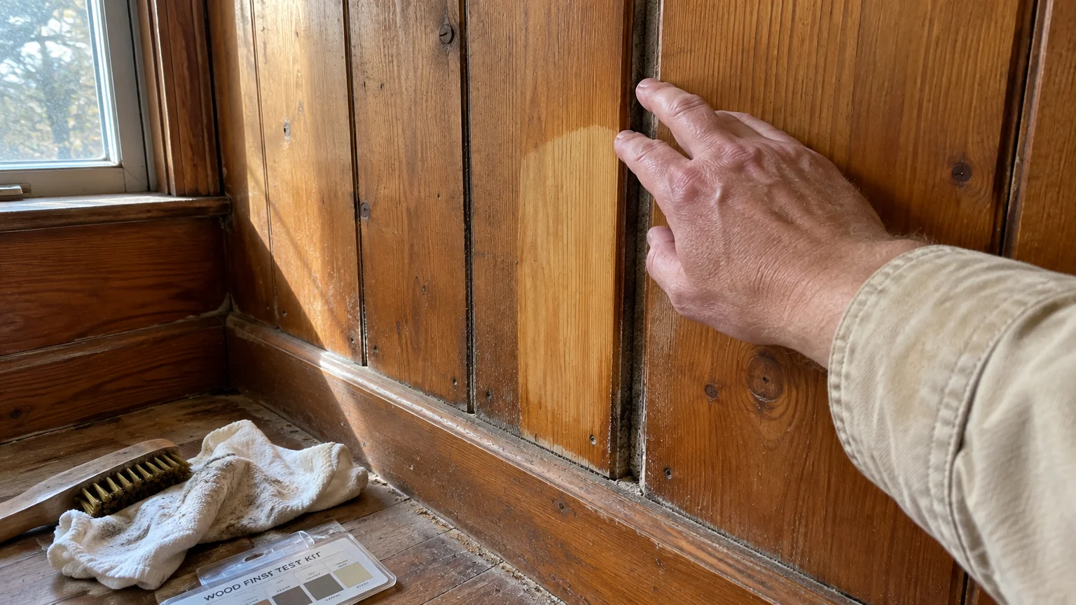
Before you purchase sample cans, determine whether your walls feature solid timber planks or thin composite veneer. Solid knotty pine absorbs paint differently than pressed plywood sheets with faux wood grain.
You must also decide your design strategy. You can apply paint directly over the paneling to create modern vertical texture, or paint adjacent drywall to frame rich, original woodwork.
If your home dates before 1978, test existing finishes for lead hazards before sanding or scraping. Review the EPA guidelines on lead paint safety to protect your household during renovation work.
Examine the grooves between the planks. Deep grooves collect decades of household dust, grease, and pet dander that ruin paint adhesion if neglected.
Wiping the walls down reveals the wood’s true underlying color. That revealed color dictates which complementary paint shades will succeed in your room.
How Color Undertones Interact with Wood Paneling
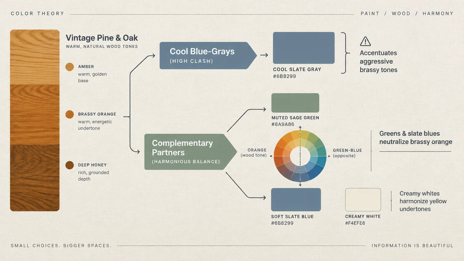
Wood paneling functions as a strong, dominant background color rather than a neutral backdrop. Most vintage panels radiate golden amber, brassy orange, or deep cherry red tones.
Color theory dictates how adjacent walls and decor will look next to these dominant timber hues. Placing cool, blue-based grays against warm orange pine causes both surfaces to clash aggressively.
Greens and slate blues, however, act as complementary partners. They sit directly opposite orange on the artist’s color wheel, neutralizing heavy brassiness while highlighting natural timber beauty.
If you prefer neutral walls, select creamy whites with warm beige or yellow undertones. Avoid stark, icy whites, which make unpainted wood paneling appear dingy and dated.
When painting directly over paneling, undertones still matter. Tannins and knots from woods like pine will bleed through light paints unless you neutralize them with specialized primer.
01 Creamy Off-White (Warm Linen)
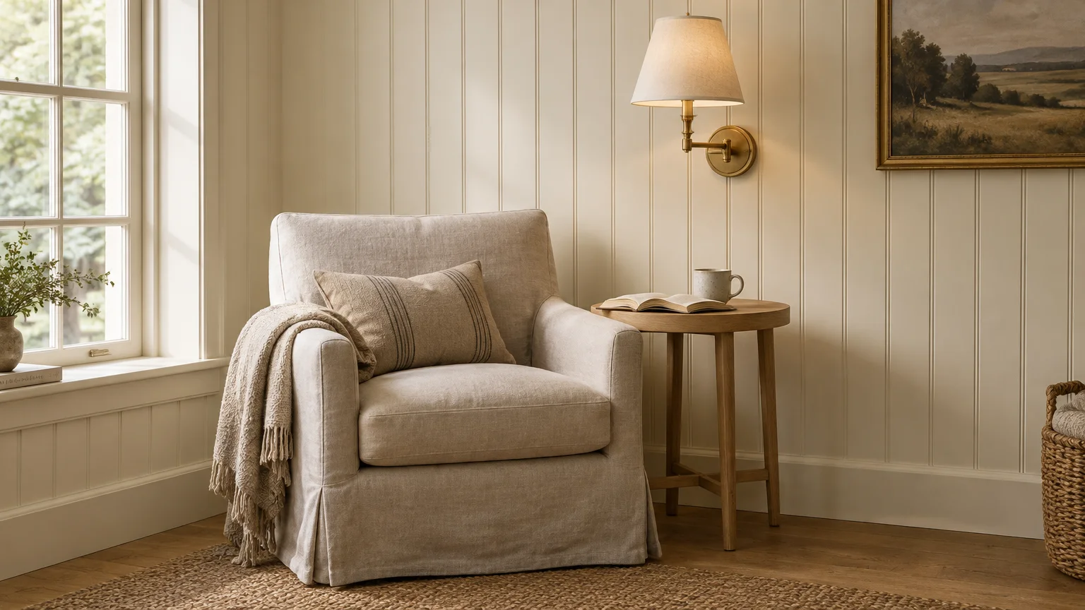
Creamy off-white provides a soft, illuminated backdrop that prevents dark paneled rooms from feeling like subterranean caves. Unlike harsh laboratory whites, cream contains subtle yellow and beige undertones that harmonize with natural wood trim.
Popular examples include Sherwin-Williams Alabaster and Benjamin Moore Swiss Coffee. These gentle shades reflect natural daylight without producing sharp, clinical glare.
When applied directly over paneled walls, creamy white turns heavy vertical planks into timeless cottage-style beadboard. The vertical shadow lines add architectural character while the warm white keeps the room feeling expansive.
If you retain natural wood panels, warm linen on adjacent drywall softens the visual weight of the room. It bridges the gap between deep timber tones and light contemporary furniture.
Pair this shade with brushed brass lighting fixtures, warm wool throws, and light oak furniture. The combination creates a clean, serene environment that feels both historic and fresh.
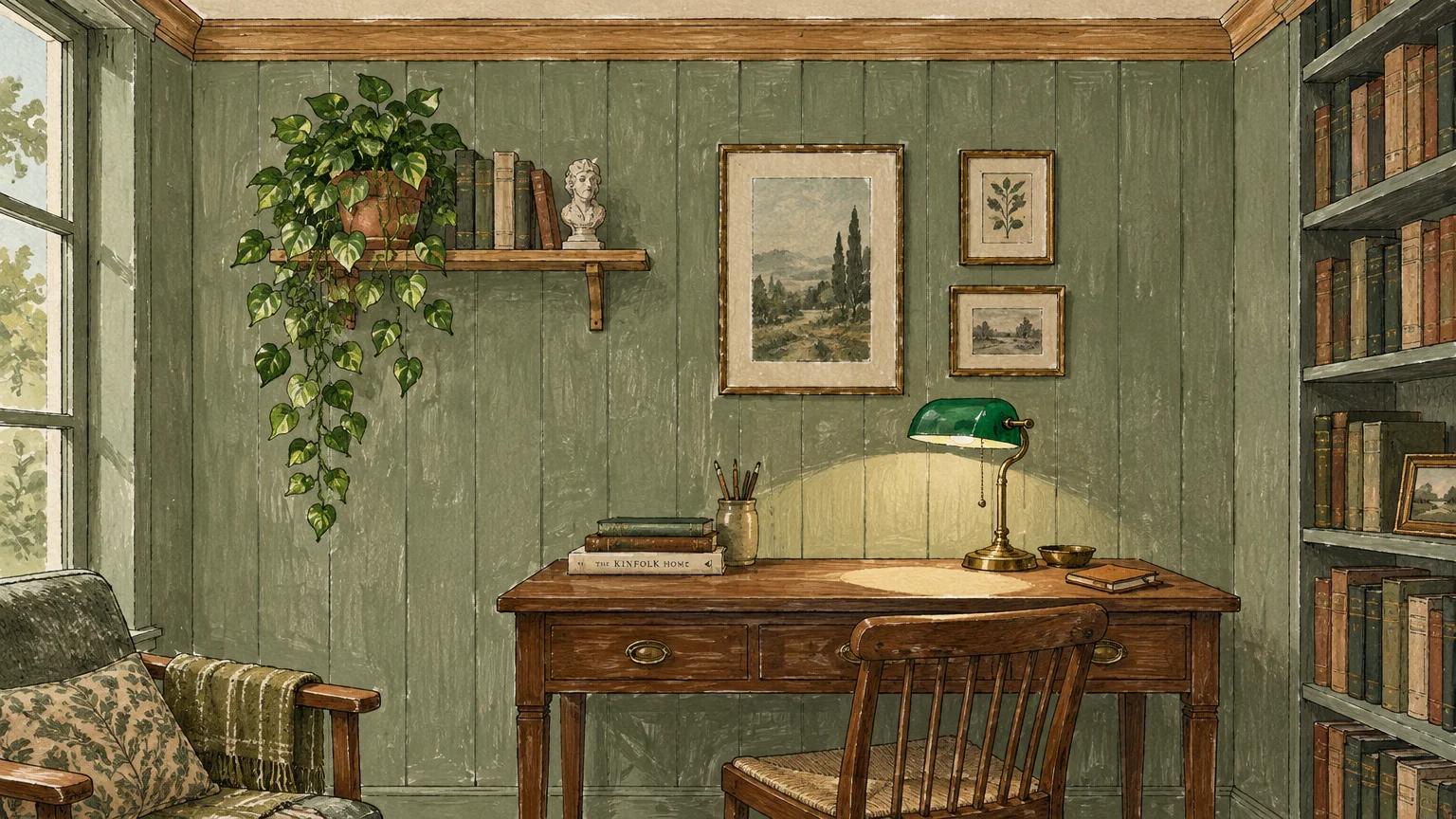
02 Muted Sage Green
Muted sage green introduces organic serenity to paneled spaces. Its earthy gray-green character sits directly across from orange on the color wheel, creating natural equilibrium against amber pine.
Shades like Sherwin-Williams Clary Sage or Benjamin Moore Saybrook Sage bring the calm feeling of an outdoor garden indoors. They reduce the visual intensity of knotty boards without competing for attention.
Coating paneled walls in muted sage gives the entire room an upscale heritage aesthetic. The soft green settles neatly into the panel grooves, emphasizing vertical depth while soothing the eye.
Sage also performs reliably under varying light conditions. In north-facing rooms with cool light, its gray undertones stabilize the space; in south-facing sun, it glows warmly.
Complement sage walls with natural jute rugs, textured linen curtains, and matte black iron accents. These earthy pairings turn old-fashioned wood paneling into an intentional design centerpiece.
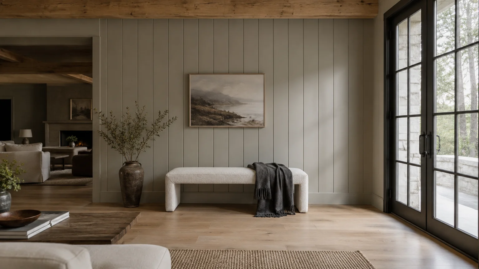
03 Balanced Greige
Greige combines the crisp modernity of gray with the comforting warmth of beige. This balanced hybrid solves the common mistake of pairing sterile, cold gray with warm wood paneling.
Colors such as Benjamin Moore Revere Pewter provide enough beige pigment to flatter honey-toned wood. At the same time, the gray component cools down excessive yellowing in older lumber.
When painted directly onto wood paneling, greige creates a sophisticated transitional aesthetic. It bridges historic architectural details with clean, modern furnishings.
If you choose to leave your paneled walls bare, greige on adjoining walls and ceiling surfaces keeps the room balanced. It prevents the timber from overpowering smaller dens or home offices.
Layer greige surfaces with cream upholstery, natural stone accessories, and light ash wood accents. This tonal variety delivers a relaxed, orderly room that remains simple to maintain.
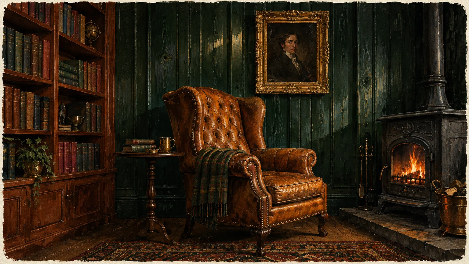
04 Moody Forest Green
Deep forest green transforms a dark wood-paneled room into an intimate, luxurious retreat. Rather than fighting low natural light, dark green leans into the shadows to create depth and drama.
Historic shades like Benjamin Moore Salamander or Sherwin-Williams Pewter Green evoke classic libraries, vintage studies, and historic lodges. They turn vertical paneling into an intentional high-end architectural statement.
Painting dark green directly across pine boards conceals knot holes and surface imperfections remarkably well. The deep pigment absorbs harsh reflections, giving the walls a velvet-like appearance.
If you preserve your natural wood walls, painting your ceiling, doors, and trim in forest green creates striking contrast. The rich green grounds golden timber boards and gives the room immediate sophistication.
Complete this classic aesthetic with antique brass task lamps, rich leather seating, and woven wool rugs. Warm ambient lighting prevents deep green from feeling overly somber at night.
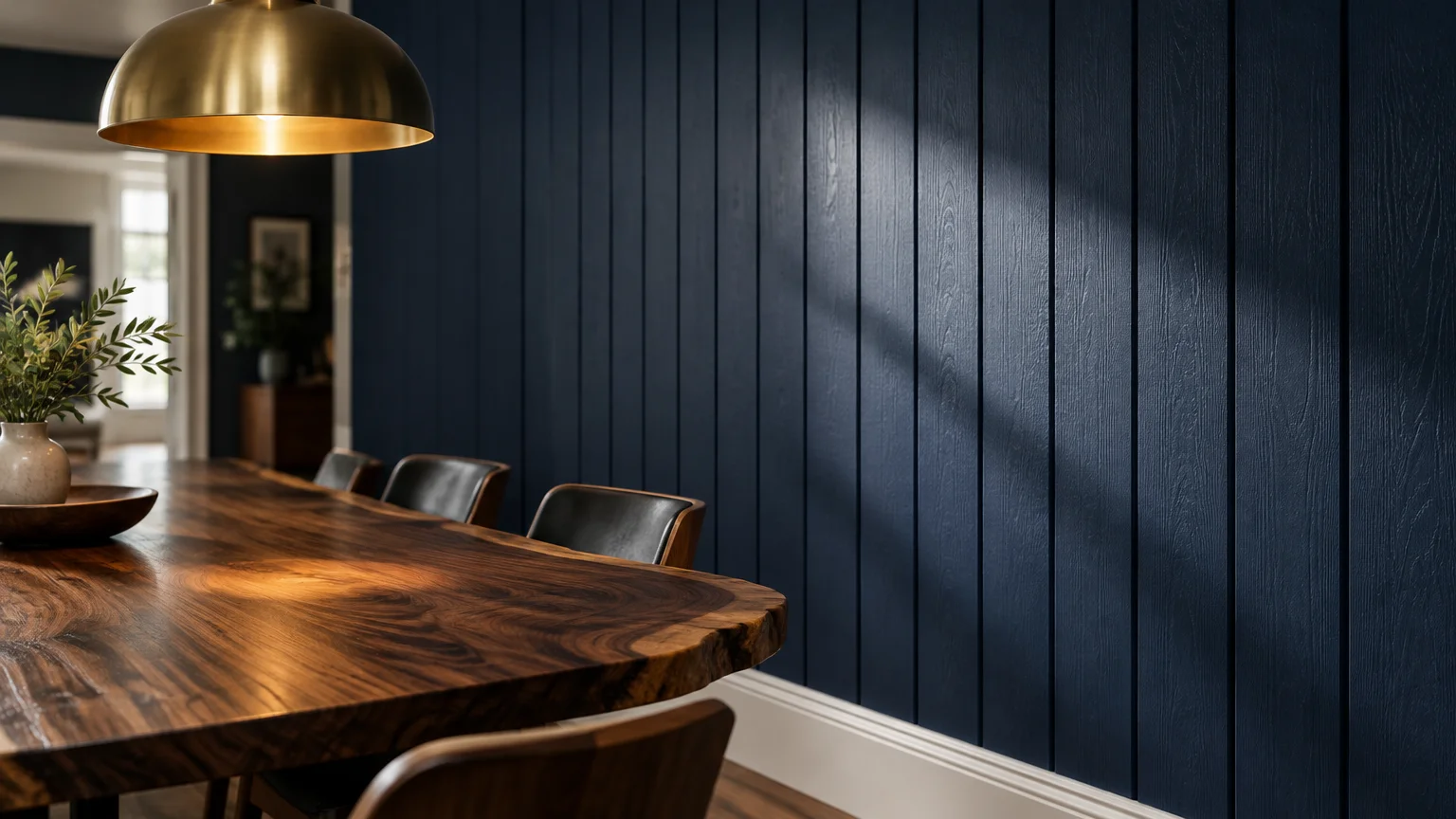
05 Classic Navy Blue
Classic navy blue brings tailored elegance and commanding presence to wood-paneled rooms. Its deep blue pigmentation sits opposite golden-yellow on the color wheel, effectively subduing brassy timber hues.
Enduring shades like Benjamin Moore Hale Navy or Sherwin-Williams Naval impart immediate structure to rooms dominated by busy grain patterns. Navy turns chaotic wood knots into subtle background texture.
Applying navy directly to dark 1970s paneling instantly modernizes the entire room. The grooves cast subtle linear shadows that elevate navy beyond flat drywall paint.
If you keep original wood panels intact, painting built-in bookcases or adjacent accent walls navy provides crisp, intentional contrast. The cool blue tones make warm honey wood appear richer and more intentional.
Style navy rooms with crisp white baseboards, natural cognac leather armchairs, and polished nickel hardware. This palette feels classic, nautical, and easy to keep visually organized.
06 Soft Slate Blue
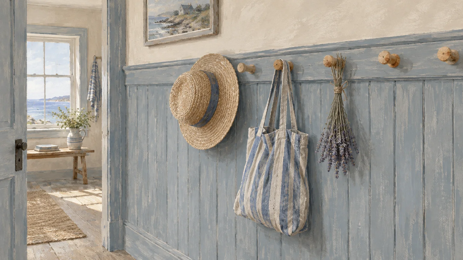
Soft slate blue offers a lighter, airier alternative to dark navy while still neutralizing stubborn orange wood tones. Infused with gentle gray undertones, slate blue keeps paneled rooms calm and restful.
Paint colors such as Benjamin Moore Boothbay Gray or Sherwin-Williams Slate Tile evoke coastal skies and stone pathways. They cool down stuffy, overheated timber tones without making the room feel chilly.
Painted over dark paneling, slate blue creates a cheerful, breezy backdrop suitable for bedrooms, craft spaces, and home offices. The grooves in the paneling add charming vertical interest reminiscent of historic seaside cottages.
When used alongside raw knotty pine, slate blue softens the aggressive amber cast of the knots. It invites peaceful light into the space while maintaining rustic warmth.
Pair slate blue with off-white cotton curtains, light-toned sisal flooring, and weathered wooden furnishings. The resulting look is casual, welcoming, and remarkably easy on aging eyes.
07 Warm Terracotta and Baked Clay
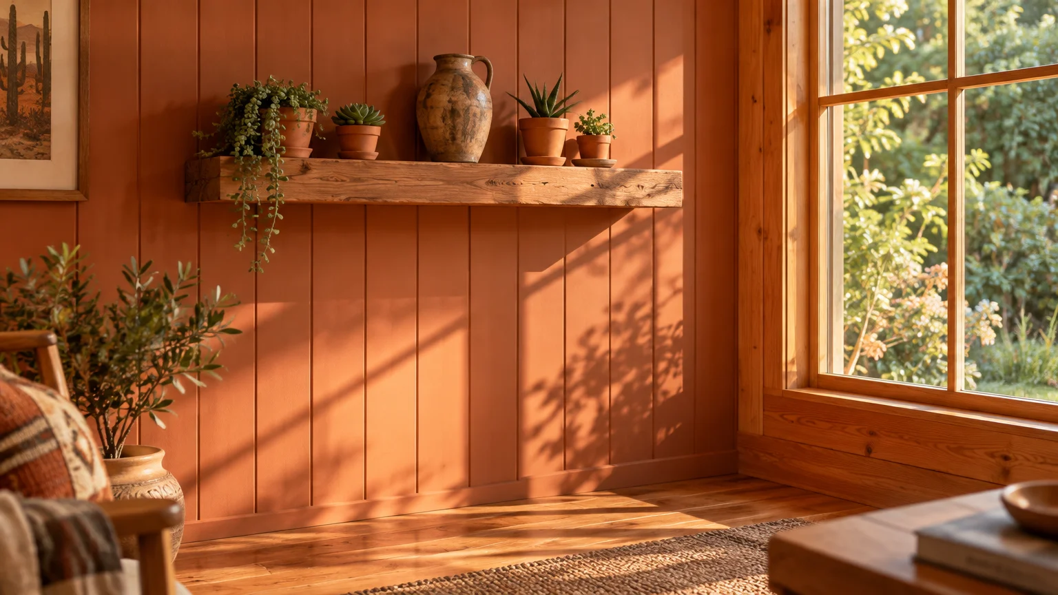
Warm terracotta and clay hues embrace the natural warmth of timber rather than attempting to cool it down. These earthy, sun-baked tones create an enveloping, cozy atmosphere in living rooms and family dens.
Shades like Sherwin-Williams Cavern Clay draw out the best elements of natural wood grain. They feel earthy, grounded, and intrinsically connected to organic building materials.
Coating vintage panels in terracotta yields a southwest mid-century modern aesthetic. The vertical lines of the boards mimic architectural adobe slats, turning flat walls into tactile art.
On walls adjacent to dark wood panels, muted terracotta produces a welcoming, autumnal glow. It complements dark mahogany, cherry, and walnut woods without competing for brightness.
Decorate terracotta rooms with woven wall hangings, textured beige boucle fabrics, and warm ceramic pottery. The combination creates a grounded sanctuary that feels cheerful during cold winter months.
08 Crisp Pure White
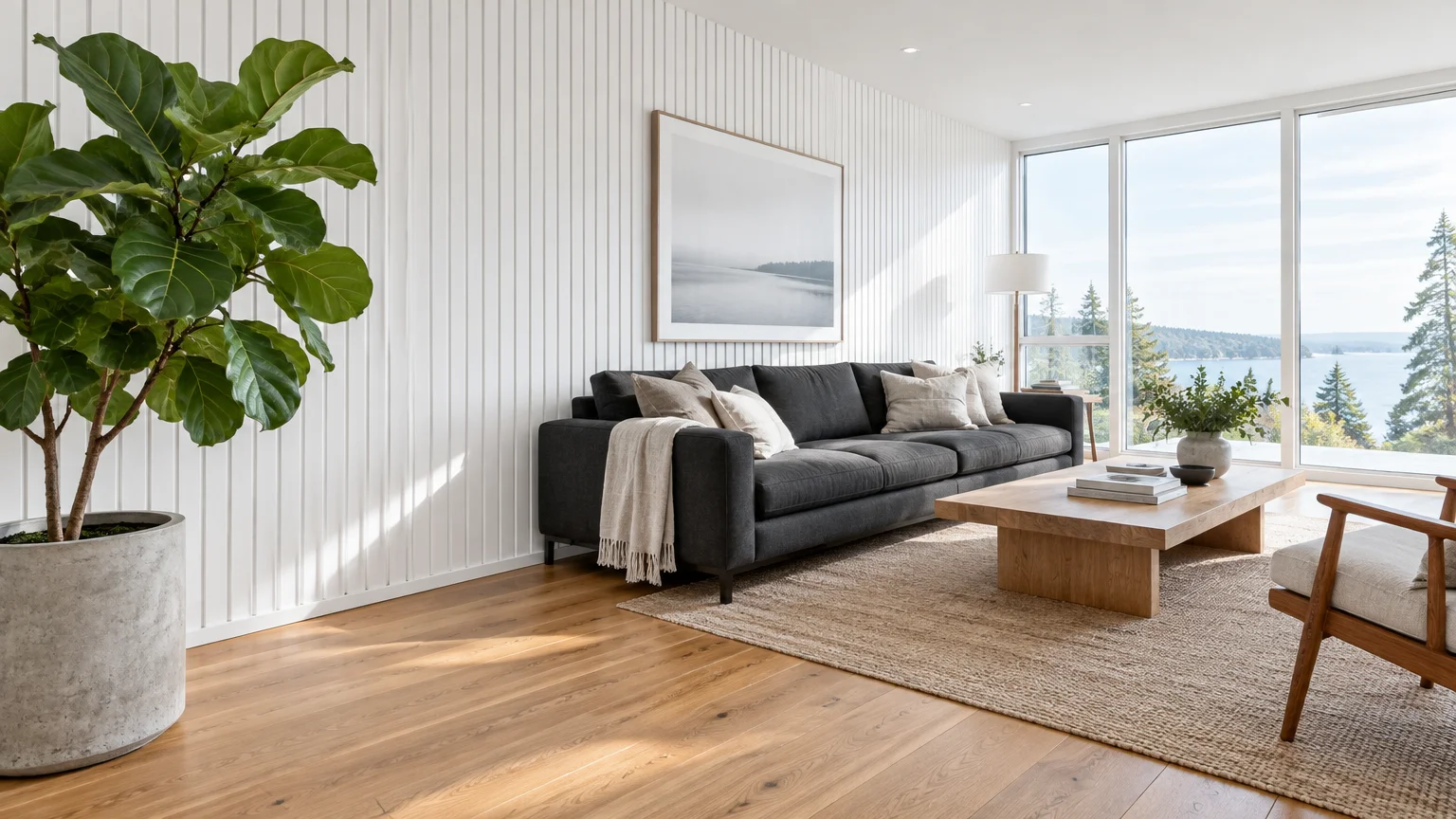
Crisp pure white delivers unmatched contrast and brightness, converting dark paneled dens into airy modern spaces. It reflects available window light deep into the room, banishing heavy shadows completely.
High-reflectance shades like Benjamin Moore Chantilly Lace provide clean clarity without sickly blue undertones. Pure white washes away the dingy, dated atmosphere typical of 1960s wood veneer.
When painted directly onto paneled walls, crisp white yields an authentic Scandinavian or modern farmhouse look. The panel seams create sharp, graphic lines that break up large expanses of flat white.
If your room features exposed ceiling beams alongside natural paneled walls, pure white on the ceiling lifts the visual height. It prevents heavy overhead timber from pressing downward on the room.
Layer pure white rooms with mixed woods, soft gray accents, and green indoor plants. This prevents the high-contrast space from appearing sterile or unfinished.
09 Dramatic Charcoal
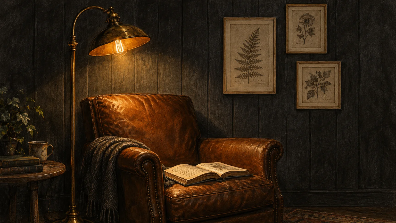
Dramatic charcoal gives wood-paneled walls an architectural, modern edge. It offers the moody allure of pure black while retaining soft smoky undertones that feel comfortable in daily living spaces.
Shades like Sherwin-Williams Iron Ore or Benjamin Moore Kendall Charcoal swallow harsh grain patterns effortlessly. Charcoal creates a seamless, velvety look that disguises dents, scratches, and outdated faux-wood patterns.
Applying charcoal to paneled walls turns an ordinary room into a dramatic theater room, sophisticated dining space, or modern bedroom. The vertical seams provide quiet, textured rhythm across the dark surface.
If you maintain unpainted wood walls, charcoal on trim, window sashes, and interior doors adds bold framing. It updates country-style knotty pine into a modern rustic cabin aesthetic.
Balance charcoal walls with light oak flooring, cream wool area rugs, and warm 2700K ambient LED lighting. Warm illumination keeps dark charcoal feeling protective and cozy rather than grim.
10 Earthy Ochre and Muted Mustard
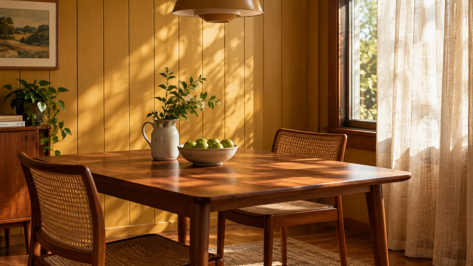
Earthy ochre introduces radiant sunshine into dark wood-paneled spaces that lack generous exterior windows. Instead of fighting the yellow notes in aging wood, ochre harmonizes with them in a joyful, cohesive scheme.
Historical ochre shades create warmth without the jarring intensity of bright lemon yellow. They echo traditional arts-and-crafts design and vintage English country homes.
Coating paneled boards in earthy ochre makes breakfast rooms, sunrooms, and reading nooks feel permanently lit by afternoon sun. The panel grooves cast soft umber shadows that accentuate the wall’s golden glow.
Beside natural dark walnut or cedar boards, mustard walls evoke a rich mid-century retro charm. The golden tones pick up honey streaks in the timber, creating a curated, intentional aesthetic.
Style ochre walls with dark charcoal accents, natural olive green textiles, and warm maple furniture. This color scheme radiates cheerfulness and stimulates mental clarity during daily routines.
11 Dusty Rose and Muted Blush
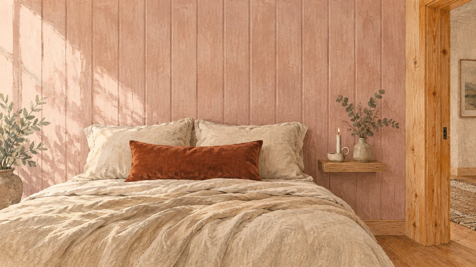
Dusty rose and muted blush bring gentle warmth, sophistication, and unexpected modernity to paneled rooms. Far from sweet pastel pink, dusty rose contains balancing gray and beige undertones that read as neutral.
Understated tones like Farrow & Ball Sulking Room Pink pair exceptionally well with dark, moody wood surfaces. The delicate color softens the aggressive, heavy presence of dark paneling.
Painting directly over paneled walls in dusty blush produces an inviting, flattering glow that makes living spaces feel restful. The subtle color highlights panel detailing while softening the room’s overall posture.
When used alongside deep brown mahogany or dark pine, blush provides high-end contrast without the starkness of white. It flatters older skin tones and adds welcoming softness to formal sitting rooms.
Complement dusty rose with vintage walnut sideboards, brushed gold hardware, and cream linen drapery. This palette feels sophisticated, calming, and distinctly upscale.
Quick Reference: Pairing Colors with Wood Species
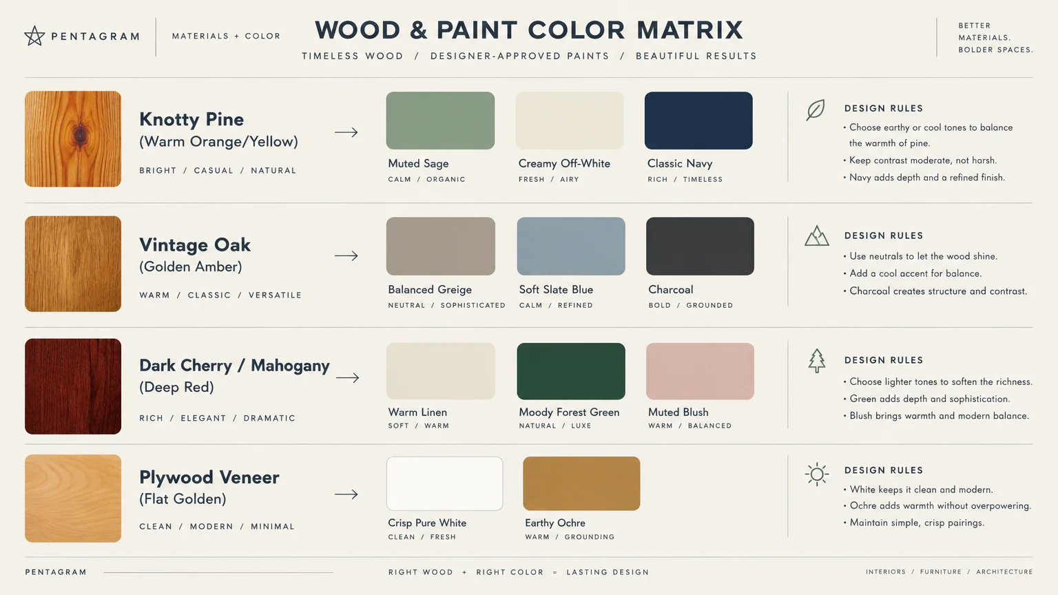
Different wood species display distinct undertones that demand specific color pairings. Use this reference table to find the ideal match for your unpainted woodwork.
| Wood Species / Style | Natural Undertone | Best Paint Complement | Visual Impact |
|---|---|---|---|
| Knotty Pine | Amber, Orange, Gold | Muted Sage Green, Slate Blue | Neutralizes intense orange; softens cabin aesthetic. |
| 1970s Faux Veneer | Dark Muddy Brown | Creamy Off-White, Greige | Brightens dark rooms; conceals artificial grain lines. |
| Red Cedar & Cherry | Crimson, Burgundy | Forest Green, Dusty Rose | Enriches deep wood grain; adds cozy library drama. |
| Golden Oak | Warm Honey, Yellow | Balanced Greige, Charcoal | Tames yellow flare; delivers modern architectural contrast. |
| Dark Walnut | Cool Espresso, Ash | Crisp Pure White, Warm Terracotta | Provides striking crispness; highlights rich grain patterns. |
Selecting the Ideal Paint Sheen for Paneled Walls
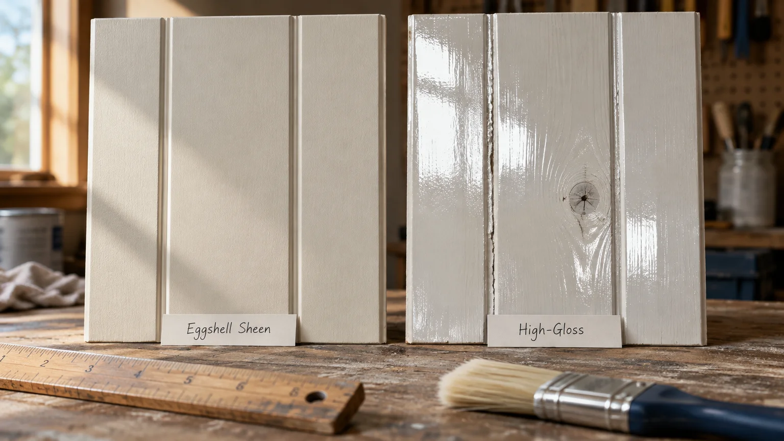
Choosing the correct sheen is just as important as selecting your paint color. Sheen controls how much light bounces off the wood’s surface and dictates how easy the wall is to clean.
Flat or matte paint absorbs maximum light and conceals wood knots, scratches, and warped boards. However, flat paint scuffs easily and proves difficult to wipe down in busy hallways or dining areas.
High-gloss paint exaggerates every small ding, seam misalignment, and knot hole on your boards. It also creates blinding glare when hit by natural window light or table lamps.
Eggshell and satin finishes strike the ideal balance for wood paneling. They provide a soft, low-luster glow that resists moisture while allowing simple cleaning with a damp microfiber cloth.
For high-traffic rooms or households with pets, satin offers slightly better scrub resistance along the panel grooves. Reserve semi-gloss exclusively for baseboards, window trim, and interior doors.
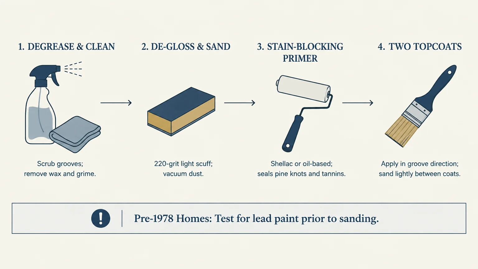
Step-by-Step Preparation Guide for Painting Over Wood Paneling
Painting directly over wood paneling requires disciplined preparation to ensure long-term durability. Skipping surface prep leads to peeling sheets, chipping edges, and bleeding resin.
- Clean the paneling thoroughly: Wash boards with a heavy-duty degreaser or TSP substitute to dissolve accumulated body oils, kitchen grease, and wax polishes. Let the walls dry completely before moving forward.
- Scuff sand the surface: Lightly hand-sand the paneling using 120-grit sanding sponges to abrade slick factory clear-coats. You do not need to strip the finish; you only need to create mechanical grip for primer.
- Vacuum vertical grooves: Run a narrow vacuum brush nozzle down every groove and crevice to suck out loose sanding dust. Wipe down the entire wall with a damp microfiber cloth or tack cloth.
- Prime with a stain-blocking bonding primer: Apply a high-adhesion shellac or oil-based primer across all surfaces. This step seals porous pine knots permanently and keeps timber tannins from bleeding through your topcoat. Ensure healthy room ventilation while applying primers by reviewing EPA guidance on indoor volatile organic compounds.
- Caulk gaps if desired: If you want a smooth shiplap look, fill uneven seams with paintable acrylic caulk. If you prefer classic panel definition, leave the vertical grooves uncaulked and clear.
- Apply two topcoats: Roll on two thin, uniform coats of premium acrylic latex paint in satin or eggshell finish. Use an angled brush to cut into the grooves first, then smooth across the face boards with a short-nap roller.
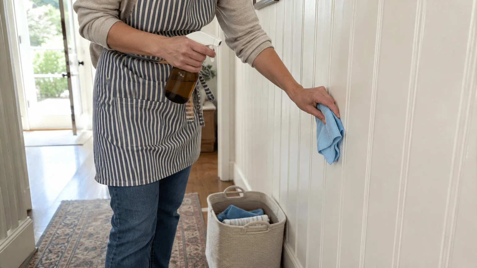
Daily Care and Cleaning for Painted Paneling
Painted paneling requires gentle, regular care to keep dust from building up within the vertical grooves. Routine maintenance protects your new paint coat and preserves an orderly room.
Dust your walls monthly using an extendable dry microfiber duster moved vertically along the plank seams. Regular dusting prevents gritty particles from settling permanently into the paint finish.
When spot cleaning scuffs or fingerprints, mix a few drops of mild liquid dish soap into warm water. Avoid abrasive scouring powders or stiff scrub brushes, which strip away protective paint sheens.
Dip a soft microfiber cloth into your soapy water, wring it until damp, and gently wipe the soiled board. Dry the area immediately with a clean lint-free towel to prevent moisture from seeping between planks.
Check the CDC guidance on indoor environmental quality for tips on controlling indoor moisture and mold. Keeping relative humidity below fifty percent prevents wood paneling from expanding and cracking your freshly painted seams.
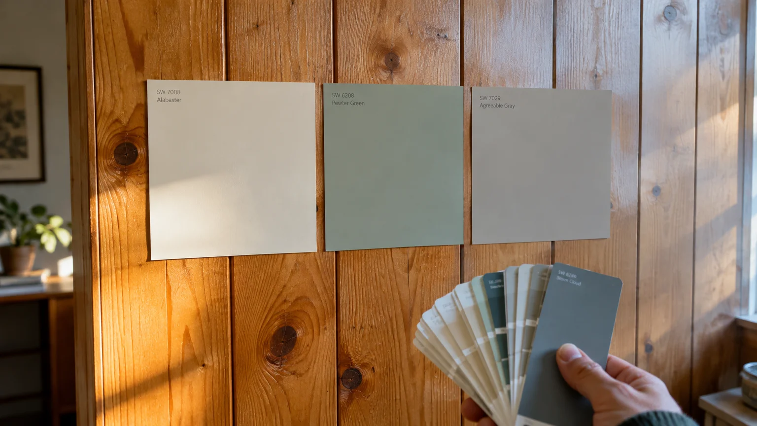
Your Immediate Next Step
Walk into your wood-paneled room today and locate the darkest corner where natural light fades earliest. Stick two peel-and-stick paint samples—one warm neutral and one earthy green or blue—directly onto the paneling.
Observe those two sample swatches at morning, midday, and under warm artificial light tonight. Seeing how the undertones interact in your room’s real environment will reveal your perfect paint color with absolute confidence.