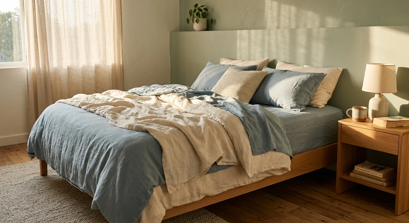
Your bedroom color directly impacts your body’s ability to fall asleep and stay asleep throughout the night. Research shows that specific hues interact with your brain’s photoreceptors to slow your heart rate, lower your blood pressure, and boost melatonin production. By strategically choosing the right paint, you can turn a restless environment into a calming sanctuary optimized for deep recovery. Selecting a supportive color palette is one of the easiest, most cost-effective ways to upgrade your sleep hygiene and simplify your daily routine. Whether you prefer cool tones that mimic nature or warm neutrals that provide a grounding effect, the colors on your walls shape how you feel when the lights go out.
The Science Behind Wall Color and Your Sleep Cycle
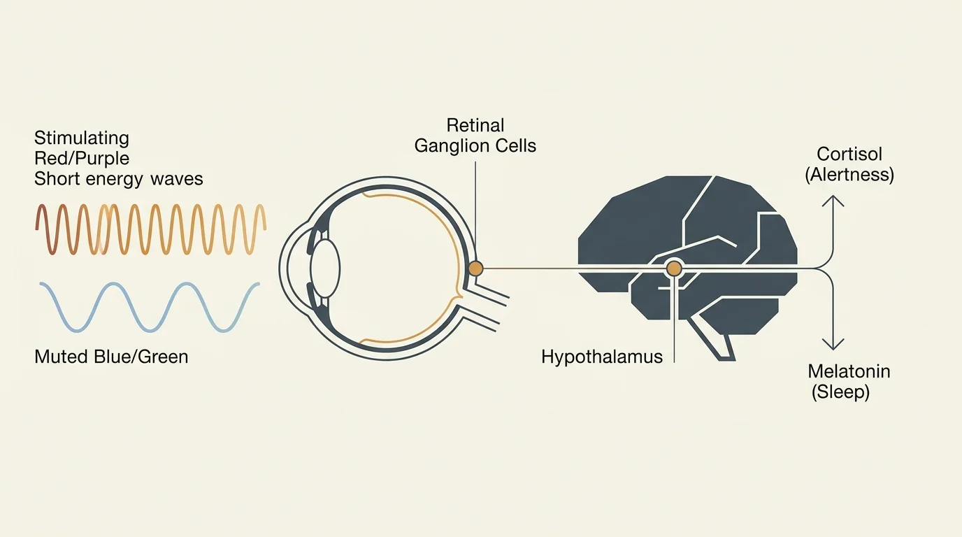
Your brain constantly processes your visual surroundings, even when you feel completely relaxed with your eyes open in bed. Specialized receptors in your retinas, known as ganglion cells, pick up light and color wavelengths and send messages directly to your hypothalamus. This area of your brain controls vital hormone production, including the release of the sleep-inducing hormone melatonin and the stress hormone cortisol.
When you look at highly stimulating colors—like a bright, saturated red or a neon purple—your brain interprets these short wavelengths as energetic signals. This interpretation inadvertently increases your heart rate and spikes your cortisol levels, keeping you wide awake. Conversely, viewing non-stimulating, muted colors signals to your central nervous system that the day is over and it is safe to unwind. This environmental cue triggers a natural drop in blood pressure and an increase in melatonin, physically preparing your body for restorative sleep. According to the Sleep Foundation, optimizing the visual design and color scheme of your room plays a fundamental role in maintaining healthy sleep hygiene. Older adults, in particular, can benefit from this simple environmental shift, as our circadian rhythms naturally become more fragile with age.
01 Soft Blue: The Ultimate Restorative Hue
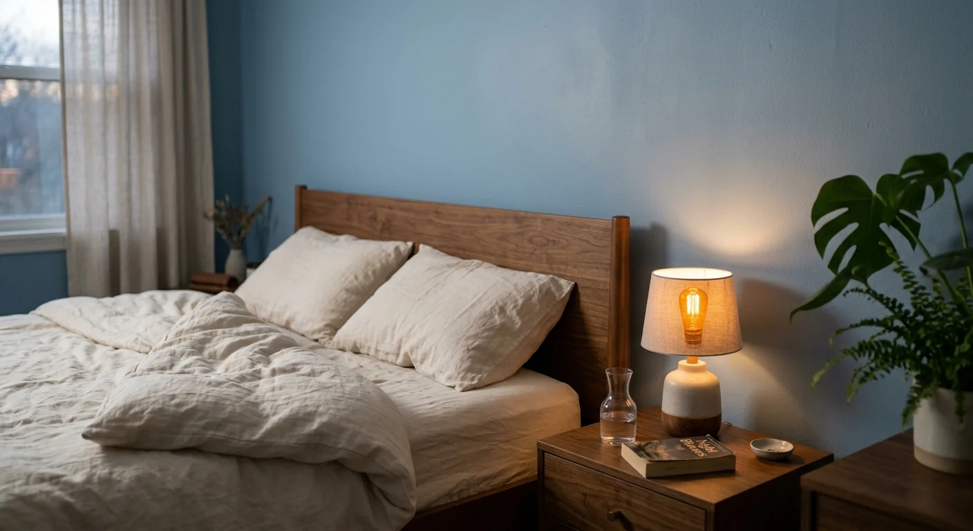
Soft blue consistently ranks as the most effective color for promoting high-quality sleep. Research indicates that blue wavelengths have a profoundly calming effect on the human nervous system. When you surround yourself with light blue walls, your brain subconsciously associates the environment with the natural tranquility of a clear sky or calm water. This evolutionary association quickly lowers your pulse, stabilizes your breathing, and dissipates the stress you accumulated throughout the day.
Practical Design Application: Choose muted, dusty blues over dark navy or bright turquoise. A soft powder blue absorbs shadows beautifully and prevents the room from feeling cold or uninviting. Pair your blue walls with warm wood furniture—like oak or walnut nightstands—to introduce natural texture. Add soft, warm-dimming LED bedside lamps to create a cozy, amber glow that offsets the cool tones of the wall without disrupting your circadian rhythm before bed.
02 Sage Green: Nature’s Calming Remedy
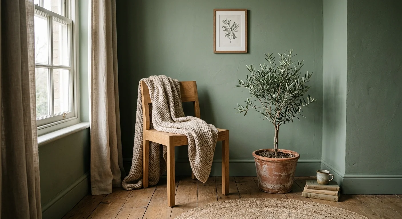
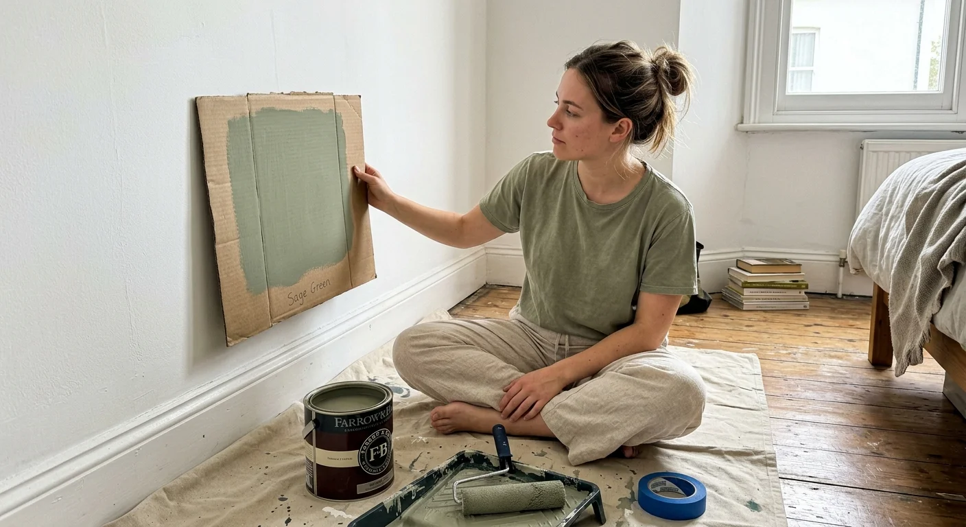
Green carries many of the same restful properties as blue but brings an added layer of earthiness to your space. Sage green specifically connects your mind to the outdoors, reducing anxiety and promoting a harmonized, balanced mood. Studies suggest that environments featuring natural, biophilic colors help people fall asleep faster and wake up feeling more refreshed and optimistic.
Practical Design Application: If you live in a bustling urban environment or an apartment with limited outdoor views, painting your bedroom sage green serves as a powerful psychological substitute for nature. Use flat or matte paint finishes to keep the color soft and prevent harsh light reflections. Complement sage green walls with crisp white linen sheets, woven rattan baskets, and a few low-maintenance indoor plants—such as a snake plant—which also help purify your indoor air overnight.
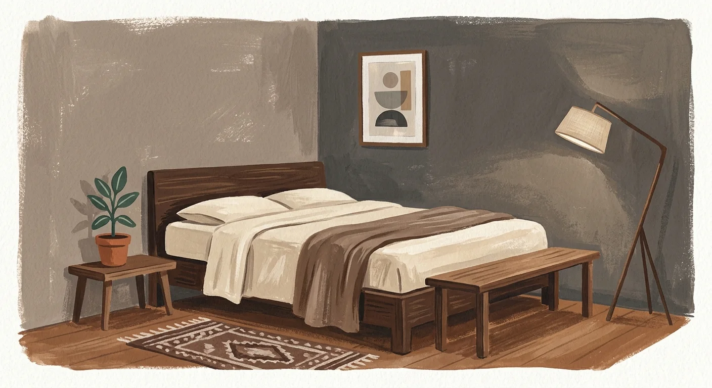
03 Muted Taupe: The Grounding Neutral
While white can sometimes feel too stark and gray can feel too industrial, muted taupe provides the perfect middle ground. This warm, earthy neutral wraps the room in a cozy, cave-like atmosphere that encourages your mind to power down. Interior designers frequently use taupe in luxury hotel bedrooms because it offers zero visual distraction while remaining highly elegant.
Practical Design Application: Taupe features varying undertones; some lean slightly pink, while others lean green or brown. Always test taupe paint swatches on different walls in your bedroom and observe them at night under artificial light to ensure they do not pull too muddy. Pair taupe walls with heavily layered textiles to build depth. Use a textured cream rug, chunky woven throw blankets, and linen blackout curtains. The monochromatic layering creates a plush, sensory-rich environment that signals your brain it is time to rest.
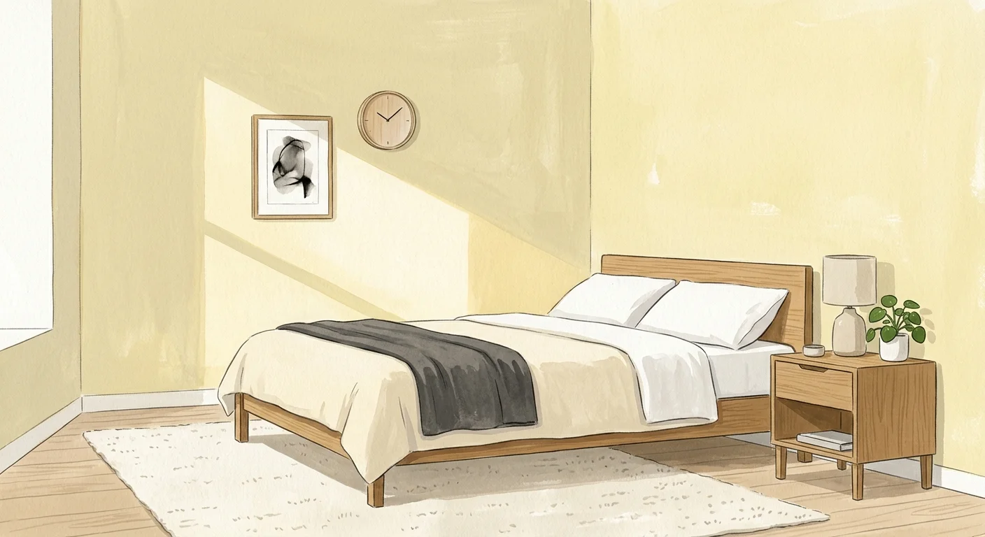
04 Pale Yellow: Warmth Without Stimulation
Yellow can be incredibly tricky to get right. Bright, saturated yellows overstimulate the nervous system and boost energy, making them terrible for your sleep cycle. However, very pale, muted yellow acts entirely differently. A soft pastel yellow imitates the gentle warmth of morning sunshine. This creates a tranquil, comforting environment that can help alleviate nighttime stress and make waking up in the morning feel much more natural.
Practical Design Application: Choose a yellow with a creamy or buttery base rather than a neon or harsh mustard tone. Keep the ceiling bright white to maintain a feeling of height and spaciousness. Because yellow reflects light easily, you must rely on heavy blackout shades to keep external streetlights from illuminating the room at night. For furnishings, use contrasting cool tones—like a soft blue throw pillow or a silver-gray upholstered headboard—to balance the visual warmth of the walls.
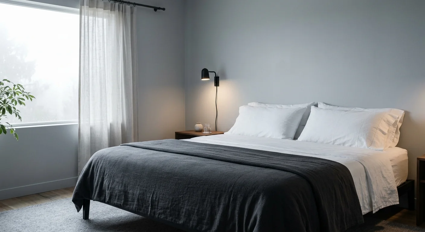
05 Silver Gray: Cool, Sleek, and Distraction-Free
Silver gray serves as a fantastic alternative to heavy, dark charcoals that can make a room feel gloomy or oppressive. A light silver gray carries cool undertones that elegantly mimic natural moonlight, creating a sleek, clean, and distraction-free atmosphere. It is an excellent choice for adults who want a modern, minimalist home that feels organized and effortlessly calm. This hue visually pushes walls backward, making small or cramped bedrooms appear larger and more breathable.
Practical Design Application: Gray can easily feel sterile or commercial if you do not actively balance it with warm, inviting textures. Avoid using matching gray bedding or overly industrial metal furniture. Instead, introduce essential warmth through brass, brushed gold, or copper light fixtures and cabinet hardware. Opt for a plush, upholstered bed frame in a warm oatmeal fabric or add a thick, woven wool throw at the foot of your bed. The strategic contrast between the cool silver walls and the warm tactile elements gives the room a sophisticated, highly relaxing aesthetic.
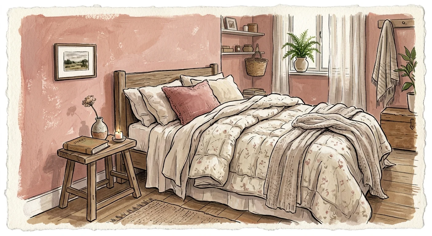
06 Dusty Pink: Gentle and Comforting
Pink is no longer strictly reserved for nurseries or vibrant retro aesthetics. A sophisticated dusty pink—often referred to as plaster, blush, or muted clay—brings a gentle, nurturing energy to a primary bedroom. Color psychology suggests that soft pinks naturally evoke feelings of physical safety, emotional comfort, and compassion. These subconscious emotional responses help reduce the relentless mental chatter and late-night anxiety that often keep people awake.
Practical Design Application: Avoid bubblegum or hot pinks at all costs; you want a color that resembles faded terracotta or dried rose petals. Dusty pink works exceptionally well in rooms that receive a lot of natural morning light, giving you a cheerful start to your day. Pair your blush walls with charcoal gray or deep forest green accents—such as a velvet accent chair, a dark upholstered headboard, or heavy light-blocking drapery. This high-contrast pairing grounds the feminine tone, giving the room a mature, balanced, and deeply restful feel.
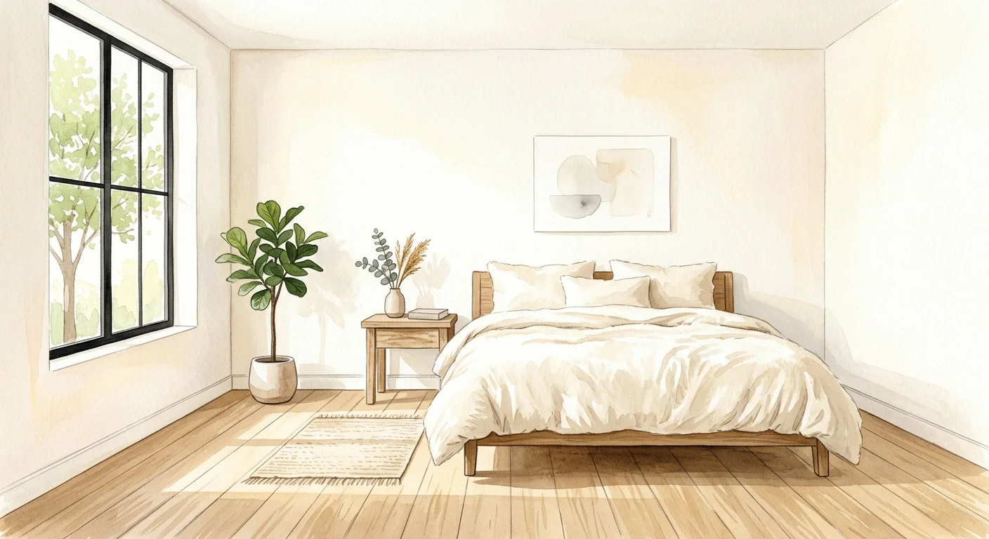
07 Warm White: A Clean Slate for the Mind
Many people prefer white walls for a crisp, highly organized look. However, stark, hospital-white walls can feel abrasive and highly reflective, making it difficult for your eyes to relax when you are trying to wind down. Warm white, which contains subtle undertones of cream, vanilla, or pearl, offers the clean aesthetic you desire without the harsh glare. A warm white bedroom effectively minimizes visual clutter, allowing an overstimulated mind to rest easily.
Practical Design Application: When using warm white, the finish of the paint matters immensely. Choose an eggshell finish for the walls; it is easy to wipe down but does not bounce too much light around the room. To keep a white room from feeling flat or boring, heavily invest in texture. Use a chunky knit blanket, a tufted headboard, and layered ambient lighting. According to Healthline, keeping the surrounding decor muted and natural ensures the space remains a dedicated zone for relaxation rather than an energizing daytime hub.
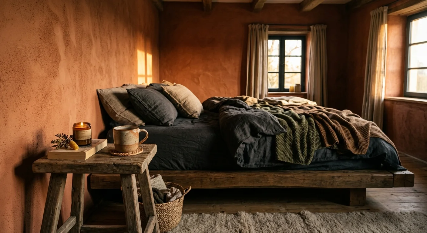
08 Earthy Terracotta: Secure and Cozy
For those who prefer a darker, more enveloping bedroom environment, earthy terracotta provides a beautiful, sleep-inducing solution. Rich, muted clay tones offer a profound sense of security and physical containment. Unlike bright red, which quickly raises cortisol, the heavy brown undertones in terracotta ground the color, making it feel organic and safe. This hue creates a den-like atmosphere that embraces you at the end of a long day.
Practical Design Application: Because terracotta absorbs a significant amount of light, use it strategically. If your room is small, consider painting just the wall behind your bed as an accent, leaving the other walls a warm white. Use warm-toned bulbs (around 2700K) in your bedside lamps to enrich the wall color at night. Incorporate organic materials like a jute rug, bamboo blinds, and woven rattan baskets to complete the earthy, restorative vibe.
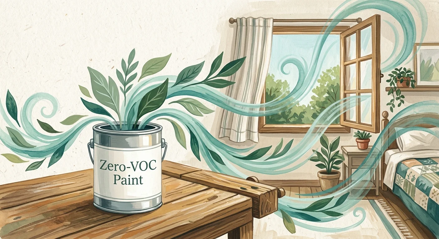
Paint Safety: Protect Your Air Quality While You Sleep
Choosing the perfect relaxing hue is only half the battle; the physical composition of the paint you apply directly impacts your long-term health. Traditional interior paints release volatile organic compounds (VOCs) into the air as they dry. These chemicals evaporate at room temperature and can significantly degrade your indoor air quality.
According to the U.S. Environmental Protection Agency (EPA), indoor VOC levels can routinely spike to 1,000 times higher than outdoor levels during and immediately after a painting project. Breathing in these toxic fumes while you sleep can cause severe headaches, dizziness, nausea, and respiratory irritation—completely negating the relaxing psychological benefits of your new bedroom color. Older adults and those with asthma are particularly vulnerable to these airborne chemicals.
To protect your lungs and ensure a truly restorative sleep environment, follow these essential safety steps:
- Always purchase interior paints explicitly labeled “Zero-VOC” or “Low-VOC.”
- Open your bedroom windows and use high-velocity box fans to pull fresh air into the room and push toxic fumes out during the application process.
- Leave the newly painted room well-ventilated and unoccupied for at least 48 to 72 hours before sleeping in it.
- Seal leftover paint cans tightly and store them in an outdoor garage or shed, never inside your home’s main living or sleeping areas.
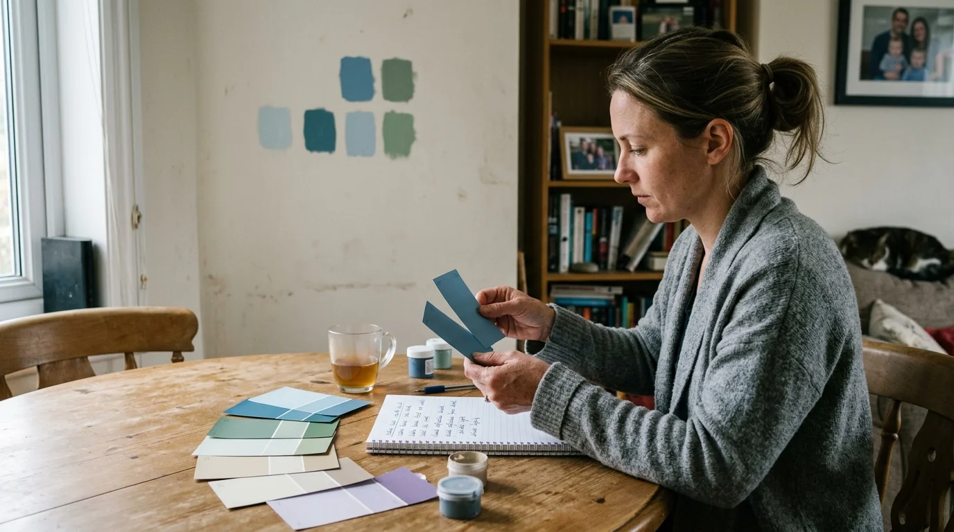
Checklist: How to Choose and Test the Perfect Bedroom Paint
Before you commit to buying gallons of paint and spending your weekend rolling walls, use this step-by-step checklist to ensure your chosen color looks and feels right in your specific bedroom. Light changes dramatically throughout the day, and a color that looks highly calming in a hardware store aisle can look entirely different once applied to your walls.
| Step | Actionable Task | Why It Matters for Your Sleep |
|---|---|---|
| 1. Buy Peel-and-Stick Samples | Order large, adhesive paint swatches instead of painting tiny squares directly on your current wall. | Your existing wall color will alter how your eyes perceive wet paint. Large swatches give you a true read of the new color without visual interference. |
| 2. Test the Light at Night | Observe the paint swatches specifically at 8:00 PM or 9:00 PM using only your bedside lamps. | You only sleep in your bedroom at night. The color must look calming under your artificial bulbs, not just in bright afternoon sunlight. |
| 3. Check the LRV Number | Look up the Light Reflectance Value (LRV) of your chosen paint. Aim for an LRV below 60 for a bedroom. | LRV measures how much light a color reflects. Lower LRV colors absorb light, making the room feel darker, cozier, and physically easier to fall asleep in. |
| 4. Choose an Eggshell or Matte Finish | Avoid semi-gloss or high-gloss finishes on bedroom walls. Stick strictly to eggshell or flat/matte. | Glossy finishes reflect light sharply, creating an energetic, distracting glare. Matte finishes absorb light, softening the room’s edges and promoting relaxation. |
| 5. Verify the VOC Content | Check the back of the paint can label to ensure the product contains fewer than 50 grams per liter (g/L) of VOCs. | Low chemical emissions keep your indoor air clean, preventing nighttime asthma flare-ups and respiratory irritation while you rest. |
The Practical Next Step for Your Bedroom Makeover
Start by evaluating the current color of your bedroom tonight. Turn on your bedside lamps, sit on your bed, and notice exactly how the wall color makes you feel. If it feels too bright, highly energetic, or visually distracting, pick your favorite restorative color from the list above and order three different peel-and-stick sample shades online. Testing swatches on your wall takes less than five minutes and sets the exact foundation you need for years of healthier, uninterrupted sleep.