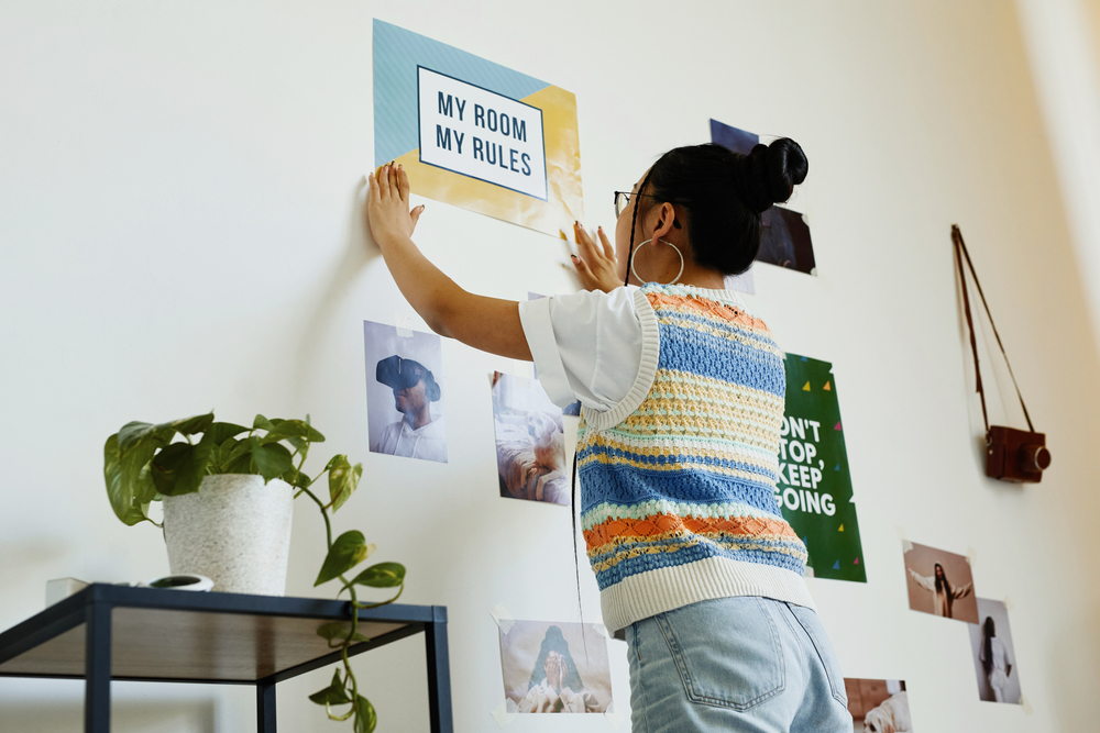
Home decor taboo: Frameless posters
Art can come in all forms, posters are a perfect example. We don’t have a problem with posters, but pros are opposed to lazy aesthetics. Generally, you’ll find them taped onto the walls of college dorms. If you want to hang up a poster, dress it up a bit by framing it.
This helps it stand out more and makes it feel more like a design decision than a placeholder. And by choosing the same frame in numerous quantities, you can also help unify a bigger collection of posters and get them to flow more cohesively throughout a space.
Home decor taboo: Matching furniture sets
Matching furniture sets are most typical in bedrooms. Many interior decorators commonly see matching sets in master bedrooms, where the nightstands, bed, and dressers are all the same finish and color. But it’s more visually attractive to switch up your furniture.
For instance, you can begin with wood grain for a dresser, a fabric headboard, and a solid-painted nightstand set to soften up the space a bit. You can even switch this combo up, but the visual difference creates contrast. Designers also commonly see these sets in living rooms.
So instead of getting the same loveseat and sofa, choose two different fabrics that complete each other. Doing this reads less, “I got this at a discount,” and more, “I made this design decision on purpose.”









6 Responses
Excellent piece. I agree 100% with your list of design flaws. They are obvious; however, it will be
very helpful to folks. Thank you.
The barn door craze was always a wonder for me! I approve of every suggestion!!
Very helpful article, although I’m not guilty of any of those.
Very helpful information!
Bravo! So many people cling to bulky recliners, bulky sofas, etc. your list is a good start for upgrading. I would add, try to keep kitchen counters as decluttered as possible.
Usually bedrooms come in sets and most stores don’t allow mix and match/ it would be helpful to hear your suggestions on that